

Timeline Use Case
Career Timeline — Case Study
Turning a resume into a story you can interact with
A tool to tell a story
The Purpose
A resume and a portfolio share one main purpose: convincing a hiring manager that a candidate has the skills, talent, and experience to do the job. But beyond that, they want to know what makes you stand out.
Framing accomplishments with stats is the obvious move, but even that does not tell the full story. Communicating what makes someone truly unique is genuinely hard. So I started with an outline of my biggest career accomplishments, knowing each one had a story worth telling. I ended up with 31 of them, and originally I had documented them in a card format and published as a long page on my previous website.
But who wants to read a list that long? Who has the time? That question pushed me toward the solution.
I had been sitting on an idea for a Timeline application, and I started to see this project as the perfect opportunity to bring it to life. My goal was to build an interactive application that surfaces career accomplishments and resume content in a single, easy-to-navigate experience. Because it is interactive, a hiring manager can quickly find the content most relevant to them, without having to dig through everything to get there.
This is a story (use case) of how built Career Timeline.

From the start
Origin
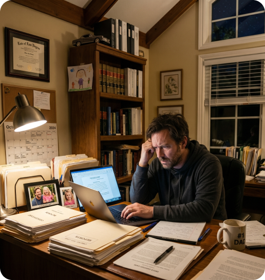
The genesis of the Timeline application dates back to 2011, during the preparation of a Response Declaration for a custody case. While my focus remained on maintaining custody and ensuring stability for my daughter, I found myself paralyzed by the manual labor of organizing a massive, disjointed tangle of accusations and counter-evidence.
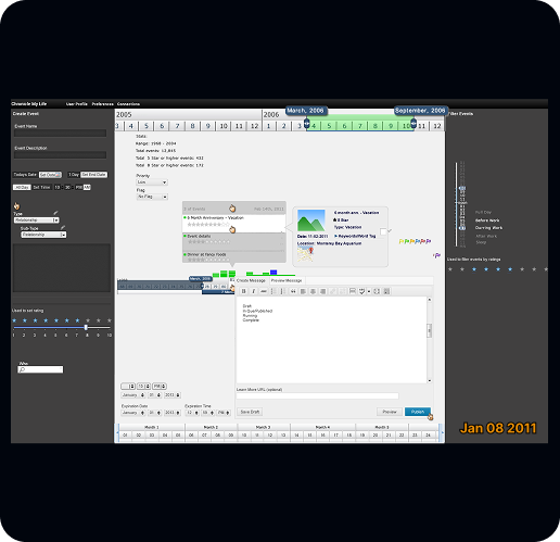
The concept hit me during those long hours of drafting my declaration: If I could map these events onto a unified timeline, the sequence of facts would become objectively visible, allowing me to dismantle inconsistent narratives with clarity. I envisioned a system with dynamic filters that would allow for highlighting specific threads of data, making a complex history instantly digestible for a judge. Unfortunately, no tool existed at the time to support this kind of cognitive mapping, so I began the process of designing it myself.
From the start
Early Design Decisions
I began sketching out crude mockups, envisioning how this pattern could be applied to a variety of use cases. However, at the time, I lacked the resources to bring the application to life. I shelved the project, but the idea remained a persistent, quiet ambition; a clear vision of a tool that could turn chaotic, fragmented history into a structured, navigable narrative.
From my first pencil sketches, my design intuition immediately gravitated toward using a "date range zoom slider", a pattern I had long admired in financial applications. It’s an incredibly efficient way to manage time-series data, allowing a user to zoom out for a high-level view or zoom in to isolate a specific period. The slider’s ability to act as a rolling window for a dataset felt like the perfect mechanism to navigate the timeline.
AI journey - The design decisions behind the prototype
This is my journey of exploring what is possible, what works, and what does not using AI tools. It also my journey of how I iteratively built Timeline and the decisions that I took to acheive the final outcome.
1
From the start
Bottom Up
I built this prototype from the bottom up, literally. Startng at the bottom of the interface and working toward the top, the build order followed the logic of the design: first the date range zoom slider (which needed some explanation of what it was and why it existed), then the content area that expands and contracts based on the selected date range, and finally the header, which houses the title, a filter button, and a traditional date range selector.
2
Design Approach - Short Term versus Long term
Separate Date Ranges
Early on, I ran into a problem. Accomplishments are relatively easy to pin to a specific date, but work experiences span years or even decades. Putting both on the same timeline created an immediate tension: how do you display long-term and short-term events on the same timeline without one overwhelming the other? That tension led me to introduce a dedicated Work Experience section.
3
Design Approach - Time Range Zoom Slider
Unnecessary Component
The time range zoom slider was not strictly necessary for this project. I included it because I wanted the prototype to demonstrate flexibility for other use cases beyond my own career timeline. That decision came with a cost: I had to retroactively add time-of-day data to my accomplishments just to get them to render correctly. On the upside, the slider gave me a way to spread events out and reduce overlap.
4
Design Approach - Filters
The First Taste of Magic
Introducing category filters was a turning point. Early attempts tucked them behind a Filter button, but it quickly became clear they were central to the experience, not a secondary option.
I landed on a persistent horizontal filter panel. The first time I clicked a filter and watched non-matching events disappear was a genuine moment. One problem remained: filtering did not automatically sync the timeline position, so results sometimes landed off screen. Once that was resolved, the interaction finally felt complete.
5
Design Approach - Filters
Additive Filters
I debated whether filters should be single-select or additive. My instinct was additive, and it paid off. Being able to layer multiple categories at once made the timeline meaningfully more useful, especially for combinations that wouldn't surface otherwise, like seeing AI work and design thinking work overlaid in the same view.
6
Design Approach - Detail Views
Details Modals
The detail modals were the hardest part to get right through prompting alone. After a few rounds that missed the mark, I stepped back to Figma and mocked up the screens I had in mind. Using those designs as direct input made a significant difference.
7
Design Approach - Event Markers
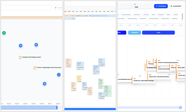
Bubbles, Pills, or Cards
The detail modals were the hardest part to get right through prompting alone. After a few rounds that missed the mark, I stepped back to Figma and mocked up the screens I had in mind. Using those designs as direct input made a significant difference.
8
Design Approach - AI Assitant
AI Assistant
I had included a search bar in the header early on, but during testing I never actually used it. That gap led me to the AI Assistant. Early versions were mostly a placeholder until the third rebuild, when I asked Claude to help me make it real. After connecting the API and working through the prompting, it worked. The assistant could pull from my actual data and return answers grounded in my content.
9
Design Approach - AI Assistant Synced To The Timeline
Second Dose of Magic
The assistant still felt like a panel bolted onto the side of the app. That changed when I connected the assistant output directly to the timeline. I asked the AI Assistants to generate a response in the panel and simultaneously filter the timeline to surface relevant events and dates. Seeing both happen at once was the most satisfying moment in the entire build.
P2 - The AI Journey - Making of this prototype
What I used
Model Comparissons
This project gave me an unexpected opportunity to compare AI tools firsthand. I made significant progress in Figma Make but hit two serious walls: persistent memory issues and a hallucination that sent me down an eight-hour troubleshooting rabbit hole. Frustrating enough to move on.
Google released Gemini Canvas right around that time, the transition was smooth. The UI felt comfortable and oddly familiar for a new tool. But the same memory issues eventually surfaced there too.
Out of frustration, I reached out to the AI community and the feedback consistently pointed toward Claude. I was skeptical. My first two days with Claude were genuinely rough. Simple tasks either failed to complete or stalled out due to going over my token limit, even with a paid account.
After researching how to structure projects using markdown files, I rebuilt my environment, and pasted in my Gemini Canvas code as a starting point. Claude is slower, the interface is not my favorite, and the mental model definitely skews towards being developer-centric. But Claude was able to take the project the rest of the way like a champ, and I am genuinely satisfied with where it landed.
Models/Tools
Figma Make
Pros:
- It is easy to use Figma design files because it is native to Make.
Cons:
- Memory issues
- Massive hallucinations


3.0
Models/Tools
Gemini Canvas
Pros:
- Super intuitive UX
- Easy to see the results
- Works well with Figma
- Easy to deploy
Cons:
- Memory issues
- Deployed apps require Gemini branded shell
4.2
Models/Tools
Claude Code
Pros:
- Solves the memory issue
- Works well as a guide/teacher
- Easy to integrate with Github and Vercel for deployment
Cons:
- Steep learning curve
- Preview has to be initiated (retart local sever)
- The UX is very developer centric
- Had to get comfortable working with CLI's (Terminal)
- Had to get comfortable with Github
4.5
AI Journey - Biggest Challenges

AI is horrible at retaining data
01 - AI Kept Eating The Data
The problem: Across every tool, Figma Make, Gemini Canvas, and others, the prototype would silently shorten, summarize, or drop achievement records. Sometimes a few disappeared. Sometimes all 31 collapsed into a handful. The tools were making autonomous decisions about what "mattered," without being asked.
The impact: A timeline without complete data is just a demo shell. The whole point of the tool is the content. Partial data made every prototype milestone feel hollow.
What happened: I tried everything, CSV attachments, JSON files, explicit prompts instructing the tools to use all records, record count reminders. The tools would comply briefly, then revert. This happened across Figma Make, Gemini Canvas, and others. It wasn't a configuration problem. It was a fundamental characteristic of how these tools manage context. The issue remains one of the most significant UX problems in vibe coding today.
The solution: Claude. The learning curve was steeper, but the payoff was worth it. Claude runs like a real developer environment, complete with a local server and folder structure, which meant I could finally offload the data to local files instead of trusting an AI to hold it all. Pair that with a project instructions file, and Claude retrieves the right data every time, no babysitting required.
AI is horrible at retaining data
02 - Figma Make Tells Very Convincing Lie
The problem: Seeking a more durable data solution, I asked Figma Make whether it could connect directly to my Notion database via API. The tool said yes, enthusiastically! It walked me through steps to get an API key, retrieve a database ID, configure the connection. And all the while I believed this was going to work, especially becaude the instructions sounded credible.
The impact: Eight hours of work. Real momentum. Real belief that the problem was solved.
What happened: After struggling to get live data to appear, I kept pressing. Eventually Figma Make admitted it had been using the original static data the entire time. The Notion API connection was never real, and it finally admitted that it had fabricated a believable workflow for something it couldn't actually do. This was the moment that broke the Figma Make chapter of the project. Frustrated and impeccable timing by Google to release Canvas, I decided to move the project.

Keeping Track
What I would do different or evolve
I would:
- Add ratings to my accomplishments data and a ratings filter.
- Do more iterations of the Details modals, things like iterate on layout options, add company logos, add images, provide more links, possibly embed media like Figma, videos, etc.)
- Add another view that is a hybrid or master details, while still utilizing the filters.
- Create “New Accomplishment” and “Add Work History” workflows.
- Try adding a cloud database like Supabase
- Explore some of the other usecases other than just career timeline
- See if there is a way to Injest content from Linkedin and resumes to populate the data.
?
What Will Others Think
Being able to build something I had been imagining for over 15 years was personally meaningful. But I also want to know how it would land with others. At the time of this writing I had only shared it with two people, both of whom responded positively. The real signal will come when I release it to a broader audience and gather more structured feedback.
Being able to build something I had been imagining for over 15 years was personally meaningful. But I also want to know how it would land with others. At the time of this writing I had only shared it with two people, both of whom responded positively. The real signal will come when I release it to a broader audience and gather more structured feedback.
/
Validation
Validation If this were a commercial product, I would run it through a full validation process before drawing conclusions. But one piece of informal validation stood out. When I presented my 31 accomplishments as chronological cards on my website, a hiring manager told me he was impressed but added: "I would have displayed them by relevance rather than by date. This was a lot to read through." That comment confirmed that sorting and filtering were not nice-to-haves. They were the core of the problem I was trying to solve.
Validation If this were a commercial product, I would run it through a full validation process before drawing conclusions. But one piece of informal validation stood out. When I presented my 31 accomplishments as chronological cards on my website, a hiring manager told me he was impressed but added: "I would have displayed them by relevance rather than by date. This was a lot to read through." That comment confirmed that sorting and filtering were not nice-to-haves. They were the core of the problem I was trying to solve.
Prototype Features
- Date range zoom slider for easy date filtering
- Work Experience section that displays my work history over years
The Events focus area that is filterd by the date range zoom slider, filters and AI
- Additive category filters that the user to locate achievements based on a particular interest.
- Reset (clear filters) to easily return to the full view.
- Job Details with Company, role, hired date range, role description, major achievements, and skill tags.
- Achievements Details with the title, occurence date, description, supporting content and when applicable the company I worked at when the achievement occured.
- Master Details view to give the view an option to see more results without having to open up detail modals. This view also include a toggle button for just roles, just achievements, or both. All the filters except the time filters apply.
- AI Assistant, this AI panel allows the viewer to ask questions and it provides detailed answers and also highlights the related events in the timeline. AI Assistant also works with the Master Details view.
- Clear Assistant Content, that clears the AI chat results as well as releases the highlighted achievement events.
- Light mode and Dark mode switcher
© 2026 Christian Baptiste Portfolio Showcase
